I turned into the fall decor aisle at Michael’s (in August, while it was over 100F for days here in Texas, but let’s not dwell on that), and I was floored.
The colors were breathtaking.
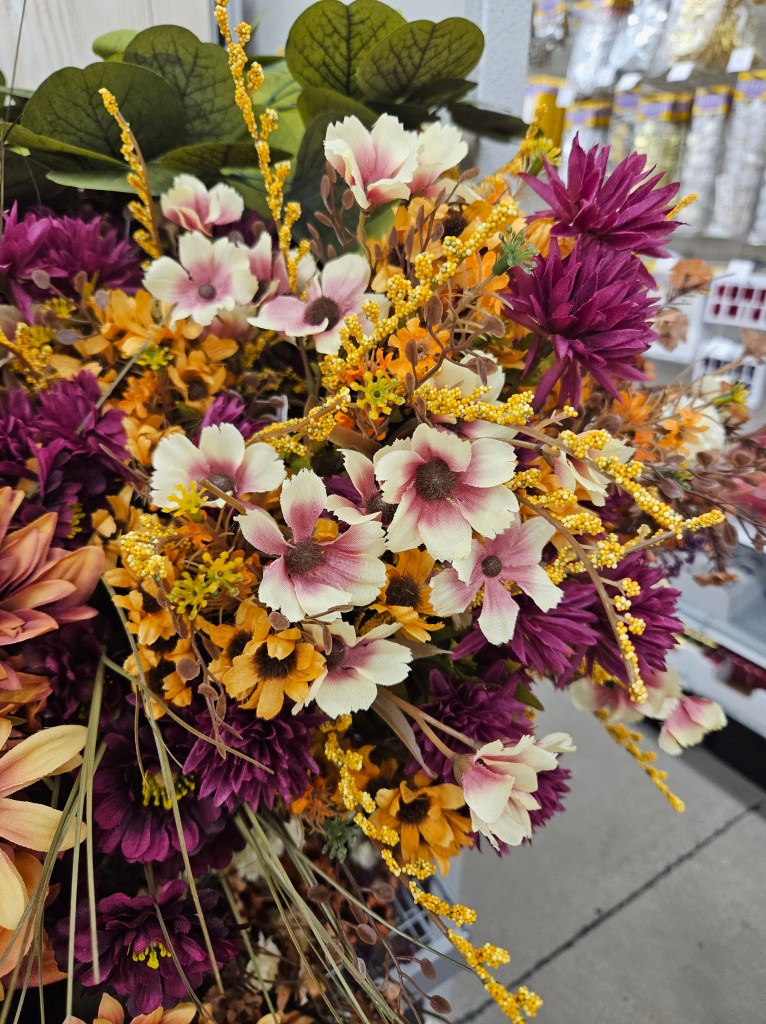
I immediately texted my former co-teacher/teacher wife Emily because these were her wedding colors. After my cousin also chose similar colors for her wedding, I have now decided these are “Zillennial Colors.” It seems like everyone born in the 1992-1999 range has some strange attraction to dusty rose, sage green, and anything that goes with them.

I don’t blame them, because these are gorgeous colors. Champagne pink, navy blue, magenta, saffron, mauve, pumpkin, beige (but, like a cool beige, not a regular beige), and so many pinks and greens.
I took pictures to show Emily that she’s “trending” at Michael’s, but then I held on to the pictures because this actually isn’t a bad way to find a good color palette.
I decided to draw on these colors for a fall floral literary quote project that I’m still working on. Here’s how I got started with putting together a palette!
Step 1: Take pictures
You know who has already done a bunch of research on trending colors? Big box stores. Take your toddler for an outing to Michael’s, Hobby Lobby, Target, Wal-Mart, or anywhere else you go for home decor. Bring a snack for the kid and bring out your phone, because you’re about to take some pictures and do some product research!
Take pictures of what sticks out to YOU and makes you feel happy. If you’re using this color palette to create, find what colors bring you joy!
Floral arrangements are great because they have 4-6 colors that balance out pretty nicely. I took pictures of wreaths, bouquets, garlands, and walked down the floral arrangement aisles to see which color combinations made me smile.
You can also find color combinations and palettes on Pinterest! I am a color palette junkie there, so I’ll collect pre-made palettes all over the place. But for this activity, I looked to pictures of floral arrangements and wedding bouquets so I was seeing the colors “in action” rather than in isolation.
Step 2: Go to coolors.com
This website is great for creating color palettes and finding trending ones. You can put colors side-to-side and see if they play well together. I’ve used this to find easy color combinations to use in Canva graphics for social media.
Here’s how to put together a color palette “from the wild” on coolors.com:
1: Click “Start the Generator!”
2: Find the camera icon in the top toolbar.

3: Upload your image or use the URL tab to go directly to the pin.
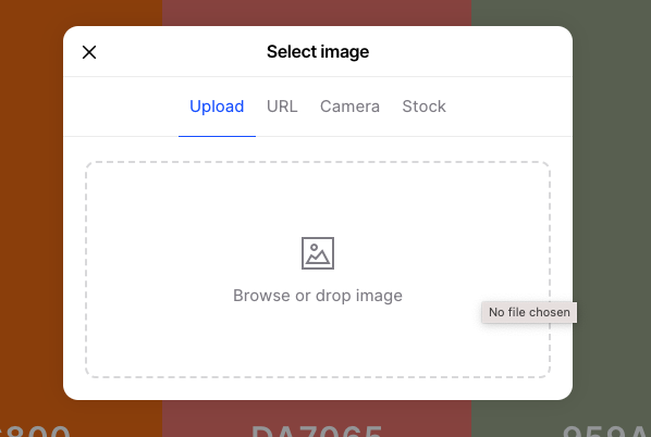
4: Use the color drop icon to get just the right color. Fill up your bottom 5 color options.

5: Go to “next.” From here, I chose “open in the generator” so I could play with colors if I needed to

And ta-da! You’ve got a color palette! From here, you can manipulate the individual colors if you don’t like how they interact with each other.

Step 3: Adjust as needed, then go out and use it!
That’s it! Take those hex codes to Procreate or wherever you need them!
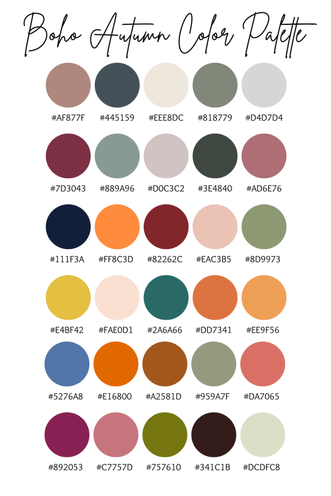
Here is my “Trendy Autumn Colors for Zillennials” Palette that I made from pulling colors from my craft store trips and favorite floral arrangements on Pinterest!
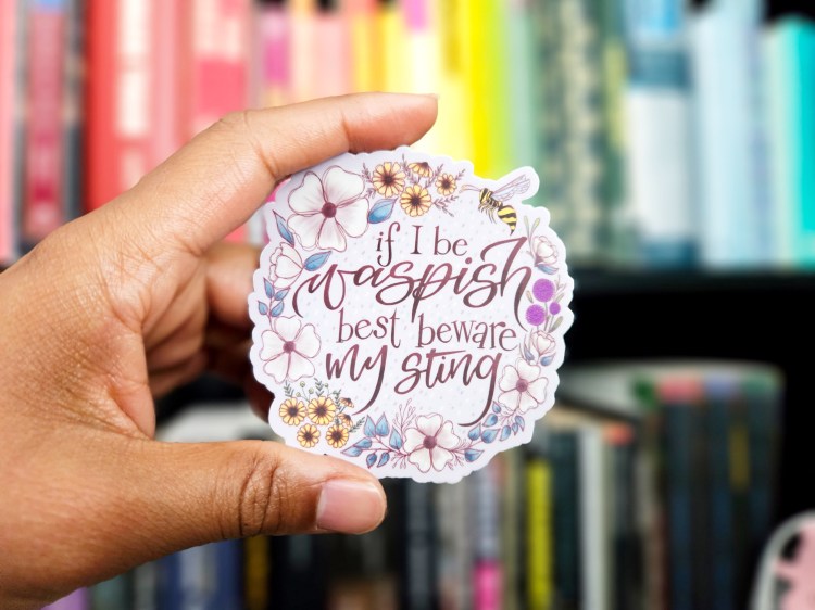
I love how these colors turned out on the first of my fall floral literary designs! Here’s the sticker I made of a fun sassy line from Shakespeare: “If I be waspish, best beware my sting”!
What will you create with your new color palette making super powers?
